
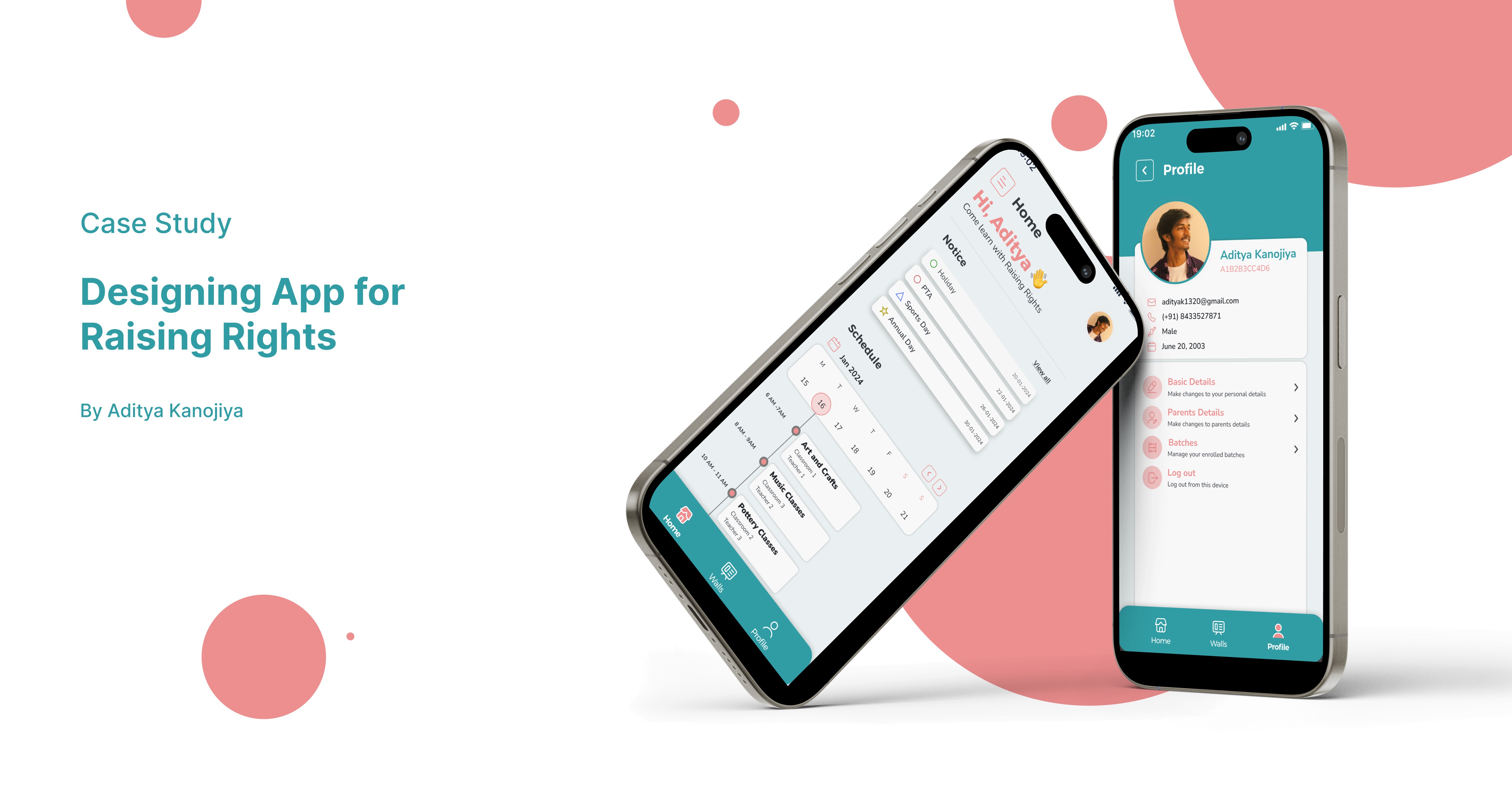
2024
Raising Rights
⚡Background
Raising Right is a mobile-first communication platform tailored for kindergarten schools and parents. It addresses the inefficiencies of fragmented communication methods—such as WhatsApp groups, physical diaries, or verbal updates—by offering a centralized, intuitive, and engaging solution. With dedicated apps for parents and teachers, the platform simplifies daily updates, feedback sharing, and batch management through a child-friendly design optimized for both tech-savvy and non-tech-savvy users.
🚨Problem Statement
Traditional parent-teacher communication in kindergartens is informal and fragmented, leading to:
Missed or scattered classroom updates.
No centralized progress tracking.
Inconsistent or forgotten feedback.
Time-consuming manual management for teachers.
Lack of structured assignment and batch tracking.
This results in parents feeling disconnected and teachers struggling with inefficiencies.
📊User Research & Discovery
Primary Research
Interviews and surveys with 5+ parents and teachers revealed:
Parents prefer image-rich daily updates.
Teachers spend 1–2 hours weekly on manual feedback.
Most updates are shared only during parent-teacher meetings.
Teachers feel overwhelmed by fragmented communication channels.
Secondary Research
60% of parents of children under 6 feel they don’t receive enough structured feedback (Times Edu Report, 2023).
72% of kindergarten teachers still use manual logs and paper assignments (Digital India EdTech Survey, 2022).
Friendly UX with visual cues increases parental engagement.
🎯Design Goals
Centralize parent-teacher communication.
Enable real-time updates and structured feedback sharing.
Provide role-specific apps for parents and teachers.
Reduce dependency on WhatsApp and other unstructured tools.
Design for accessibility and inclusivity across diverse regions.
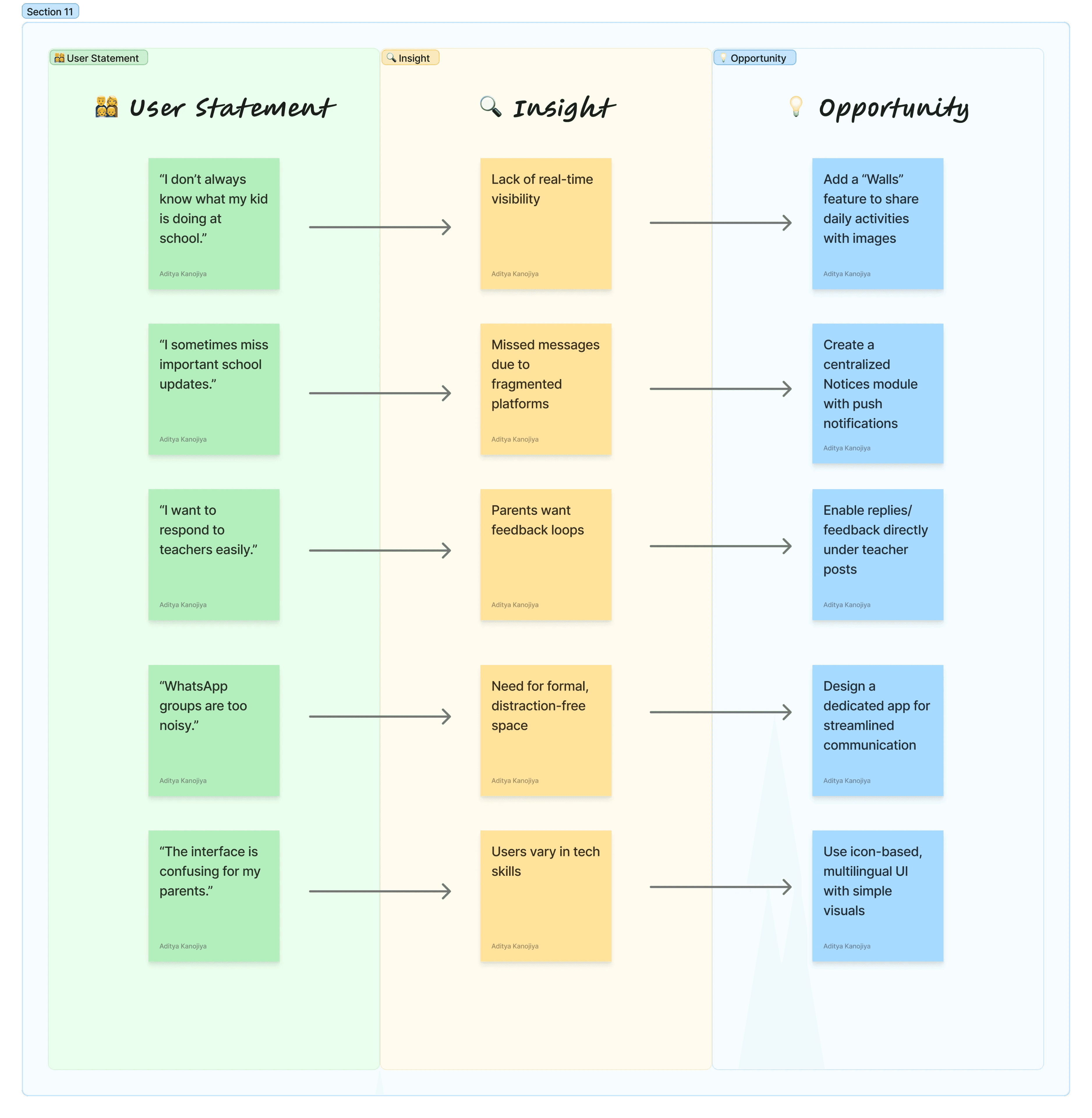
🧠 Extracting User Needs
🧭Design Process
User Interviews – Gathered frustrations, expectations, and preferred communication styles.
Personas – Developed to represent parents (non-tech-savvy guardians) and teachers (time-constrained educators).
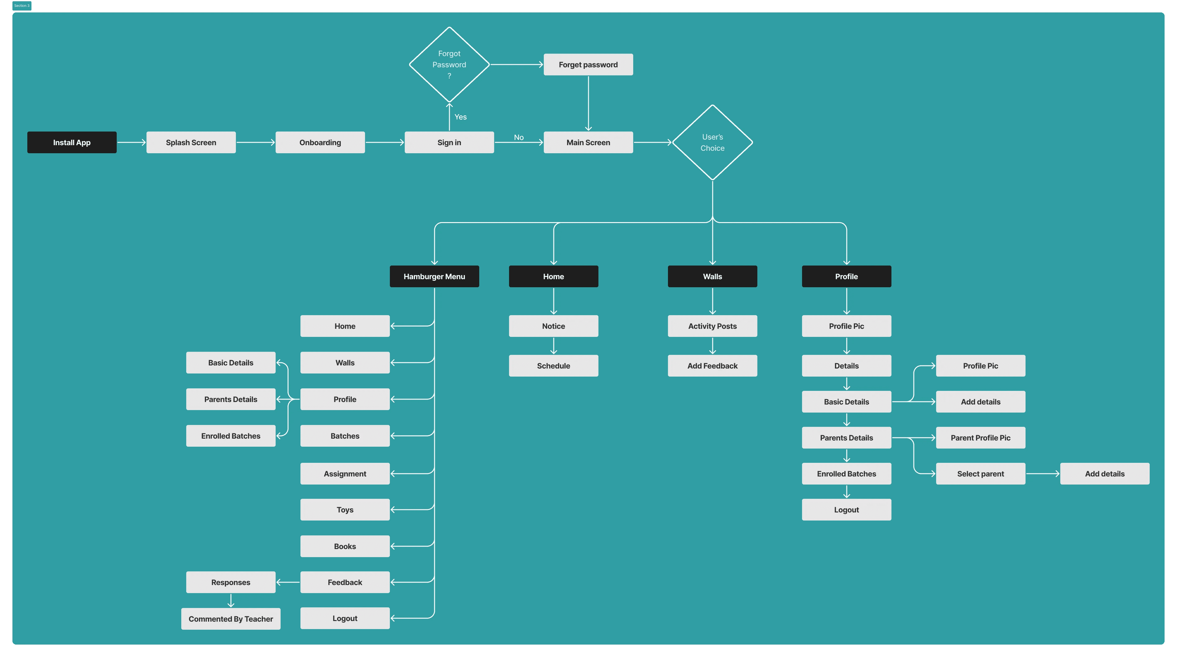
Information Architecture – Created to ensure intuitive navigation and simplified task flows.
Wireframes – Sketched low-fidelity layouts followed by user flow diagrams.
UI Design – Focused on simplicity, warmth, and visual storytelling with soft palettes and clear CTAs.
Prototyping & Testing – Interactive prototypes validated through feedback sessions with teachers and parents.
👤 User Personas


🧩 Information Architecture
🎨Low Fidelity Wireframe
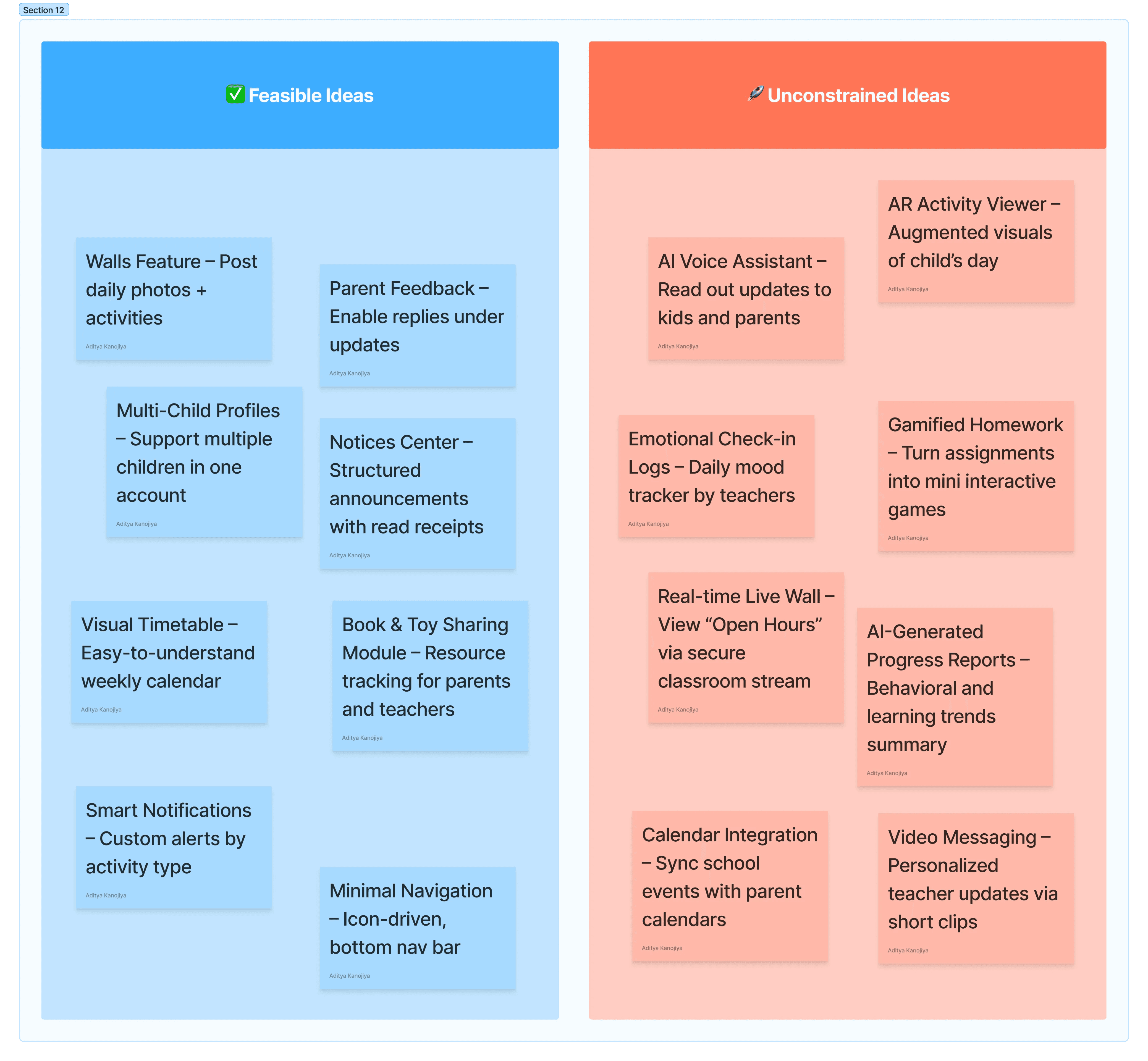
🎨Solution & Final Design
Daily Classroom Updates – Images, text, and activity logs.
Feedback Module – Interactive two-way communication between parents and teachers.
Assignments & Batch Tracking – Due/completed work displayed visually.
Onboarding Flow – Simple, linear, and task-driven setup.
Dashboard – Quick overview of recent updates and pending tasks.
Walls (Feed) – Centralized updates in a scrollable format.
Profile & Enrolled Batches – Role-specific details for parents and teachers.
Books & Toys Section – Supplementary resources for parents.
✅Results and Impact
Missed updates reduced by 70%.
Teachers saved up to 5 hours per week on manual coordination.
40% of parents felt more engaged in their child’s school life.
Parent participation in discussions and events increased significantly.
📚Learnings
Early-stage research clarified that visual cues and images are essential in engaging parents.
Splitting functionality between parent and teacher apps simplified user experiences.
Designing for non-tech-savvy audiences highlighted the importance of icon-based navigation.
Multilingual and offline features proved critical for adoption in diverse regions.